Featured Post

WELCOME TO LOGO INSPECTOR! (Please Read)

Showing posts with label typography. Show all posts

5.21.2021

CASE STUDY: CHANEL

COUNTRY OF ORIGIN: FRANCE

INDUSTRY: FASHION

Hey friends, everyone's favorite logo inspector here with a quick look this week at one of the more iconic logos in the fashion world, if not the world itself. Yes, it's CHANEL. Forgive me if I seem more surprised at the story behind this brand than some of you, but fashion isn't necessarily my thing, and if it is yours, that's cool too.

But yes, Chanel as a brand was the brainchild of Gabrielle Chanel, better known to history as "Coco Chanel." I thought this was some long story about socialites and children of some magnate putting gobs of capital into their fashion pet projects, and I couldn't have been more wrong. Ms. Chanel grew up in obscurity and relative poverty, and was very much a self-made women. She moved to Paris in the first decade of the 20th century and worked as a seamstress while moonlighting as a cabaret singer at night. One of the more famous songs she sang to soldiers was a song called "Who Has Seen Coco?" In time, it became her nickname, and it stuck when she went on to create her own brand of clothing. Far be it from me to rattle off her historical importance to that industry, but I will say that she built the brand herself by innovating fashion itself, establishing the famous women's Chanel suits, the "little black dress," and of course her famous fragrance, "Chanel No. 5."

THE LOGO

The logo is one of the staples of style and prestige and fashion in the modern Western world, and it's one of those designs whose aesthetic merit and flare are less important than the tradition it carries. Ms. Chanel designed the mark itself, and its two interlocking "C's" obviously stand for her inherited first name and her born surname. There's some interesting interplay between foreground and background within those C's— the more I look at it, the more I start seeing that white, almost almond shaped "thing" in the center, and those two fishtail forms reaching in at either side. But for the most part, it's fairly basic. But, as we've discussed before, in the branding world, there's nothing at all wrong with that.

I love the symmetry. We're symmetrical objects, we people. Have you ever noticed how things that look the same on one side as the other just tend to catch your eye, feel right, feel like that's intuitively how they should be? There's a lot of great articles and studies out there about why human beings crave symmetry in the world around them, how we finding it relaxing or reassuring, and how it reinforces some subconscious desire for order and meaning in the world around us. What's interesting about symmetry in design is it automatically creates this sort of quality control or fact-checking function inside us. You see one side a certain way and almost reflexively your eye drifts to the other side to confirm that it is the same. It's like it automatically triggers the Logo inspector in all of us!

We've also discussed here in previous posts the idea of gender in graphic design. Some designs feel more masculine, and some more feminine. So obviously, a logo for a woman's fashion empire would intuitively be designed as feminine and soft and gentle, right? The answer, of course, is no. This logo is bold, strong, geometric, and balanced, and features a strong, widely stances set of letters to depict its name. Why is that?

I read in this article that Ms. Chanel was originally inspired by a set of ornate windows in a home she lived in as a child, but she did not create the logo until 1925. As a designer and something of a student (and teacher) of the history of graphic design, there are some historical cues that we might follow to see her train of thought in this mark's creation. For example, it's not that feminine stylings in design had not been cultivated at this time; quite the opposite. The Art Nouveau style of design, featuring organic lines and feminine beauty, had already had its day in the sun, peaking somewhere around 1910 or so. At that point, Ms. Chanel was in Paris, of all places, so I'm sure it was all around her and had become the standard for advertising, packaging, and design in general. In other words, it had become status quo.If you might think that this would be the perfect aesthetic styling for a fashion designer trying to make a mark with women's dresses and styles at the dawn of the Roaring 20's, you may be predictably right. And I'm sure that's why Chanel did NOT go this route.

The 20's saw the emergence of several ideologies of design in art, architecture, and yes, advertising. Art Deco had arrived in Paris by this time, featuring strong, clean, sharp lines that implied power and industry. Likewise modernism was evolving rapidly, featuring simplistic interpretations of the real world that focused less on recreating reality and more about interpreting it in a new aesthetic way.

I would think that all of these factors led Coco Chanel to create her logo the way she did; as a departure from the old, as something bold and masculine, as an almost abstract symbol that became its own visual point of reference. Its roots lie more in traditional French Art Deco (what you and I think of as "Art Deco" probably lies more in the American reception of the Art Deco style, i.e. the look of skyscrapers and Ayn Rand cityscapes and vintage Superman cartoons, etc). But yet there's more to that Chanel logo than that. There's something very abstract in its simplicity, almost suggesting that you should be trying to "see" something in those interlocked C's that isn't actually there. 

TYPOGRAPHY

The typeface is available today, I've seen clones called "Chanel" and "Couture" and a few others that essentially exist to capture the design decisions that went into the Chanel name. But the original typography in the branding was a hand drawn typeface that was just following modern aesthetics; a bold, broad-columned sans serif faces was hardly unique in that window of time, but it was fresh and new and helped channel a sense of something stylish and modern.

What's amazing is that over the next fifty years that same art direction of the Chanel brand, and even Coco Chanel herself, became a standard of timeless style and sophistication as a result of the products that were associated with it. You can see here as these advertisements evolved from the 20's into the 60's, the design remained consistent, but just FEELS more and more substantial as they pass down through time. As I've said in the past, graphic design can be created to invoke many things, but tradition can never be invented.


In the end, it's a great example of how a brand, a logo, even just a name, can have decades of equity and user appreciation attached to it. The style or the design decisions really aren't as important as the product and its emotional and material value to the user, which is almost funny to hear myself say because as a designers and artists, we're constantly trying to tell ourselves otherwise. 


In any case, the Chanel brand is one of the more famous ones in the landscape of logos, whether you're a fashion person or not. I love how simple icons like these become a part of the visual vocabulary of our civilization that transcends individual countries, languages and societies. Simple shapes like the Chanel C's or, say, the golden arches become archetypes that we just recognize, regardless of who we are. It's almost like these logos are as integral to the human condition as letters or numbers. Or maybe I just think about this stuff too much.

What do you guys think? Leave comments on the Twitter page! I'd love to hear some feedback. Thanks!

Sources include: Wikipedia, Medium.com, bbc.co.uk, etc

5.13.2021

CASE STUDY: BASKIN ROBBINS

COUNTRY OF ORIGIN: USA

INDUSTRY: Food

Yes, of course, it's the Baskin Robbins logo. If you live under a rock or perhaps above the Arctic Circle, you may not be familiar with the brand, but Baskin Robbins is an ice cream franchise. Their tagline and marketing gimmick is "31 flavors," which basically revolves around what was once a novel concept that while most ice cream shops would offer you vanilla, strawberry, chocolate and perhaps a few rotating flavors, Baskin Robbins would always have 31 choices, setting them apart and perhaps attracting customers solely for its promise of variety and choice. Why 31? Well, apparently the number is meant to suggest you can go there "every day for a month and not have the same flavor twice." Not a bad idea, I suppose— it suggests repeat visits and almost feels like a dare in advertising form.

HISTORY


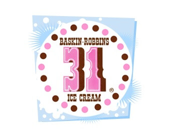
I'm not gonna dive too deep on the history assessment this week. Apparently the brand has been around since 2018, and the whole '31' marketing gag has been around since, well, before marketing was even a thing. These old logos are pretty strange though-- it's amazing how you need that 'Ice Cream' in there just to establish what the heck it is. The old cowboy fonts and inclusion of brown probably were there to suggest chocolate, strawberry and vanilla, but without the "Ice Cream" spelling it out, they kind of look like old stock car graphics from the 50's or something. Very bizarre.

The current logo was rolled out in 2006, and it's this one that I'm going to focus my attack. I mean, my review.

WHAT I LIKE

Ummm, the colors, I guess?

This logo is one of those ones that always show up on those "clever logos" lists that people outside of the business seem to throw together for, well, reasons.

I do like the colors. They're unique the pink does contrast quite well with the blue. It would seem that Baskin Robbins has been partnering some shade of blue with a bubble gum pink for some time now. It makes sense; the colors feel whimsical and candy like, and they just sort of scream treat or sweet. "I scream for ice cr--" okay okay, I'll stop now.

But yeah, beyond that... this isn't one of those type of appreciative posts.

WHAT I DO NOT LIKE


Yeah, yeah, the B and the R have a "31" inside them. It's supposed to be one of those "hidden logo finds" that people who don't really understand branding think is smart and well executed. I'd counter that this thing is about as hidden as a 40 foot crater suddenly opening into the earth on your front lawn, but I suppose I don't see these things quite the same as others, so maybe it's just me.

It just feels over the top and way too "trying to be clever" for my taste. It's right there and not at all missing or low key, and I would go so far to say it actually betrays itself in terms of functionality, and I'll tell you why.

Typography is about delivering information using familiar shapes that our brains already recognize. You take a "C," "A," and a "T" and arrange them in a specific order in ways that relate to each other and the viewer's brain sees an animal that meows. But those letters do need to work together. If you start to manipulate those letters or the relationship between them, you also risk changing the viewer's perception of them. If you look at this example here, the first word clearly reads "CAT." the second is less successful, in part because of the atrocious letter spacing. Does the T below with the CA, or is it doing something different? And finally, in the last example, the C is a different color, creating segments of relation your eye as the viewer. You don't see it as C-A-T, you see C and then an A-T beside it. The use of color can seriously hamper the effectiveness of typography. My daughter loves to write words on cards or or notes with every letter a separate color, and what she doesn't realize is, well, it doesn't look like a name, it looks like a collection of letters. The unity breaks down. Gestalt relationships unite visual elements into core ideas, and color variety in the letterforms is usually a gestalt killer.

When it comes to our OH SO CLEVER BH gimmick here in the Baskin Robbins logo, you're actually seeing such a breakdown in the letters themselves. Both the B and the R are segmented, and the segments are colored in such a way to unite the 31... but not the B and R so much. The 31 is visible and apparent because the pink ties them together, but for that same reason I think the BR thing doesn't work. The more I look at those letters, the more I don't even see the BR. What's the name of this place, 31 Flavors?

And don't even get me started on that crazy typeface for the name. the "K" in baskin really bothers me, and it looks like they're trying to look both fun and youthful AND yes, again, clever, all at once, and as a result it doesn't really feel like any of those things. I'm not opposed to the bouncing baseline here-- a baseline is the imaginary line typography rests upon, and in this case it's been sacrificed to look all bouncy and haphazard in its attempt to look "fun" and/or "clever." It's just another thing they have going on here. Too much salt can ruin the soup... and this is some salty broth if you ask me.

Maybe it's just me. Maybe I am focusing too much on my own unique perception of the colors and the type, and assuming that's how others see it. Maybe I've always kind of just hated the name because my last name is "Robbins" and I've had more than my share of funny guys growing up who thought they were the very first person to ever consider calling me "Baskin." You know, because they thought they were.... wait for it... "Clever."

But I think this logo is far too cute for its own good, and it kind of gets on my nerves. What do you all think? Anybody wanna go get some Haagen Dasz?

Sources include: BaskinRobbins.com, 1000-logos, logosworld.net, Wikipedia