Country of Origin: Japan
Industry: Automotive
So.... Nissan has a new logo. Perhaps you're just recently seeing it. Probably a better question is, "how long ago was it unveiled, and is it still 'new?'" Well, this graphic is actually almost a year old, first rolled out in June of 2020. But the process of unveiling a logo, and specifically of UPDATING A BRANDING DESIGN, is fairly complex and would probably make a good story in and of itself here at the Logo Inspector sometime. But it is an ongoing process.
What logos do best is working as a sort of instant activator of memories, feelings, thoughts, emotions and experiences of a brand-- we can that your own personal BRAND EQUITY. As your relationship with a brand grows, so too does the power of these pieces of art and your ability to recognize them and connect with your thoughts on the company they represent. So what happens when they change the art?
Yes, it can be a slow, and sometimes uneasy process of transferring your connection with one logo to another.
LINE ART
In this case, Nissan has opted for simplification-- it's what we in the business would call ONE COLOR LINE ART or ONE COLOR VECTOR ART. If you're wondering what a 'vector' is, it refers to the way the art is created, and the software in which it was built. More on that some other time. In the case of the Nissan logo above, yes, it is a single color, namely black— but it's also designed in such a way that it can function as multiple colors on varying backgrounds.
This graphic, presumably part of the press release, displays what I mean. The logo can change easily by changing its hue, easily translated to light colors or dark colors or even complex backgrounds because the design itself is not complex. Logos with multiple colors (say, MasterCard) or one very dependent hue (think Twitter's bird) immediately pose challenges to being displayed on certain colors and are much less flexible.
AUTOMOTIVE BRANDING
Perhaps a better question is, why did Nissan change? You might ask, what was wrong with the new one? Especially if you're a Nissan driver and you became very used to seeing that old shield in your driveway or staring you in the face every time you sit down behind the wheel.
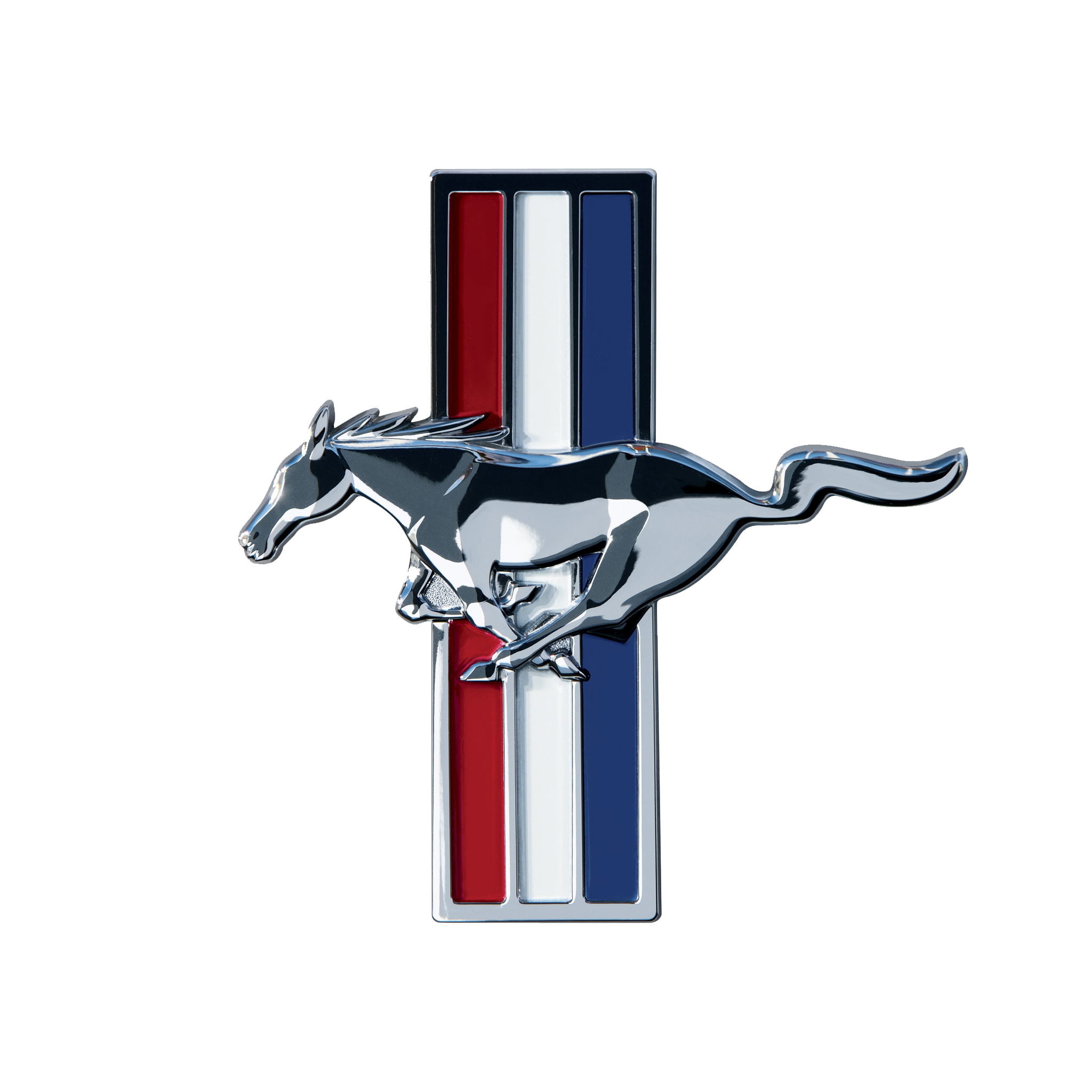
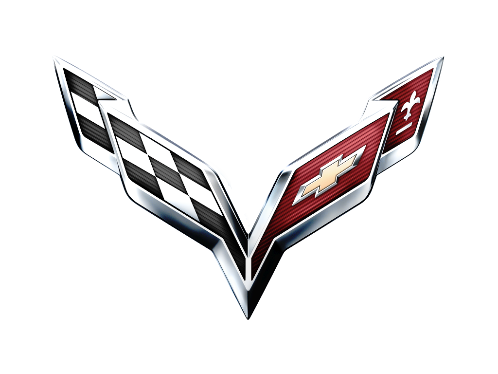
Car companies... have a lot— A LOT— of vested interest in branding. It's a major part of their industry. Every company has a badge or shield that typically serves as their primary logo. It's how you know you're seeing a Ford when it's a new make or model you haven't seen before. But even beyond the logo on the hood, every car company also creates branding for EACH SPECIFIC MODEL— typically in the form of word marks on the back of the car, or in some cases a specific iconic logo for individual models. For example, A Ford Mustang not only has its Ford logo, but also the familiar horse graphic as well. Corvettes are another good example.
But what kills me with automotive branding, specifically in print and in digital applications, is the way the artwork has been rendered. Obviously when, say, a Nissan logo goes on a car, it's usually in chrome or chrome-like plastic, shiny and beveled and impressive. There's a long history of chrome on cars and branding and all of that, and there's no arguing that it looks great on a car.
But over the past 30 or so years, as graphic design and the tools of the trade have evolved, car makers and the artists working for them have been able to render highly complex logos that capture the look of those chrome shields. What's more impressive is they are still vector art, meaning they will reproduce cleanly in different applications and are not bound by things like file size and resolution. But, again, more on that in another post.
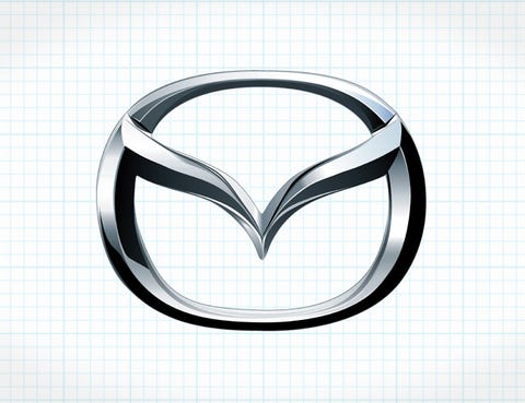
Here's an example, this dated Mazda logo. It's ridiculously chromed out, and perfectly rendered. The process actually uses gradients in very complex ways to sell the illusion of an actual automotive shield, even though this thing would be going on print and advertising applications. But they're not the only ones— basically everyone in the industry starting doing this in, say, the mid 90's, and that's just how it was.
But if that sounds dated, it's because it is. And I think the industry has decided that it was time for a change. Over the past four years or so, we've seen the automotive industry moving away from these heavily stylized brand graphics in favor of the simplified one-color approach. You may ask, "Why?" And I'm sure every company has its own reasons... but if you look at the entire situation as a timeline, it basically lines up with the surge of business in social media, app, and mobile site applications. Those complex graphics tend to break down as they get smaller, and smaller and smaller. Even the Vette logo above looks kind of hard to discern because of the size I chose to display it at. Simple line art is cleaner, more versatile and lots of different sizes and colors, and is also promoting a sense of newness to an industry that always seems to follow each other in terms of aesthetics.
(Case in point, as a young designer I once decided I was going to 'reinvent' the car ad for a local Volkswagen dealer. It was smart, and used white space to associate cars with their pricing, and created hierarchy for different models and the dealers' urgency to sell them. I thought it was really something special. And the dealer HATED it. It just didn't 'look' like a car ad. They follow their formulas and stick to them, because that's what the other guys are doing. Just felt like a story worth sharing.)
Nissan is one of many auto makers that made this change to sharper, cleaner, simplistic vector branding.
This article by Dezeen breaks down several and also includes dates to help put together a sort of timeline if you're so inclined.
What I find most interesting about this trend is that, well, the logo itself doesn't often change. The Toyota logo to the left is the same proportions and shapes of the original Toyota logo, it's just rendered in black, or whatever color they choose, instead of being locked into a series of color gradients that make it look VERY much like shiny metal. It's mostly cosmetic.
BACK TO NISSAN
Except when it's not.
In the case of Nissan, they didn't just 'simplify' the brand. They did actually redesign the elements. If I had to guess why, it's because that bar and circle on the old mark is, well, kind of boring, or at least WAS/IS boring when rendered in simple black. You'd also be left with a black bar and necessary reverse white text, ALL the time, which might defeat the purpose of simplifying for lower screen resolutions and such.
What I see as a designer, though, is much more purposeful. I think the biggest difference I see in the new vs old logo is the scale of the name within the art. Look at the two logos below. The green square is basically the footprint of the logo; it represents how much vertical and horizontal space, in pixels, the logo will make up.
Now observe the red boxes. That's the part of the footprint used to render the brand name. See how much smaller it is on the left as opposed to the new one on the right? It may not seem noticeable when up close or rendered large, but as that logo gets smaller and smaller, the name becomes less prominent. It's also just good branding design, because the larger and less bold font (along with the cleaner line art rendering) helps drive it home and remain recognizable, and ultimately, more memorable.
What my box graphic above illustrates is a breakdown of the real estate within a logo. Good logo designers are very cognizant of how they use the space they occupy— with name text, with graphic elements, and even with how much empty white space the mark takes. In this case the name was designed to be much more prominent and yet still is similar enough to the original that it won't feel like a full-on departure of the brand you're connected with.
So all in all, it's not a sea change, but rather part of a trend. And a pretty solid job on the designer's part to make good use of the opportunity to clean up some other things as well. I mean, seriously, I can't be the only one who was put off by those slanted mid slab elements of the 'S' in the old logo. See how the middle of the S's isn't parallel with the baseline of the text? Sure, it's unique, but it just kind of bothered my aesthetic sensibilities and felt unbalanced.
What do you all think? Is this good? What would you have done differently? Do you think the industry will shift again in another 10-15 years?
And yes, for what it's worth... I am a Nissan driver. And my brand experience is absolutely affected the lousy stock sound system in my car.
Sources include: Dezeen.com, carlogos.org, and Google.