Country of Origin: Switzerland
Industry: Conservation/Wildlife Preservation and Research
This is the famous logo of the World Wide Fund for Nature. Yes, that's right-- that's not even the same name you think this organization had. Same here-- it was only while writing this study up that I learned they recently changed their name from World Wildlife Fund to World Wide Fund of Nature. But this is a recently new development, right? Yeah, still no. This has been their name since 1987, and most likely predates our own exposure to the brand.
If you're a Gen X person like myself, chances are the first time you'd heard of the World Wildlife Fund was when they successfully forced the World Wrestling Federation to change its name somewhere around the year 2000. Actually they had an agreement in place for years to let the brands co-exist, but changed their stance when the wrestling league violated the terms. Perhaps they didn't like Jake the Snake Roberts' handling of his pets in the ring?
At any rate, the WWF is an international group that advocates for the ethical treatment of animals and nature, specifically the defense of endangered species and the proper stewardship of the earth by the human race. How successful they are in these pursuits remain to be seen, and we won't even get into the scandals and controversies that have swirled around the organization. Let's just focus on that beautiful logo.
HISTORY
The WWF's iconic logo was first developed in the early 60's, when the brand was developing its mission and wanted a symbol that would promote its mission as an animal rights group with a distinct global footprint. The group was the brainchild of several prominent influential leaders, captains of industry and even princes-- founding members include a Rockefeller and the recently deceased Prince Philip. Also in this group was famed British conservationist Sir Peter Scott, who came up with the idea of using a panda as the group's logo, inspired by the first Great Panda put on display in a western zoo in London just a few years before. He developed the first simple sketch to the left, which would later be developed into this one color line art treatment on the right:

(SIDE NOTE: I recently read elsewhere, on the fantastic and always well-documented Today I Learned Reddit page, that all pandas in zoos remain the property of the Chinese government and come at a hefty fee of $1 million per year or more. Basically zoos around the world 'rent' the pandas to live in their facilities. Just thought that was worth mentioning, tangent over)
COLOR
So, at any rate, the panda was chosen and a simple black and white illustration was developed. It was simple and efficiently captured the look and feel of this amazing creature that had a bit of buzz surrounding it in swinging London, but there was also an ancillary motive for its choice of palette. Quite simply, the founders of this new WWF felt they could save a bit of money by keeping the mark a simple one color line art black on white. This makes sense, for at the time most publications were partially full color at best, printing the bulk of its pages in black and white or one-color spot applications. Frugal, even for princes and Rockefellers!
EVOLUTION
Time over the next half century would see the logo evolve, moving away slowly from a fairly literal pen and ink illustration of the asian ursine creature, and becoming something more abstract and elegant. I wouldn't exactly call the initials of the group's anagram a word mark, per se, but the initials were added and the typography would see a few changes of late. But obviously, the only reason we're even looking at this today is because of that branding redesign in 1986.
The updated logo was created by Jerry Kuyper of Landor & Fitch, San Fransisco (I believe at the time it was simply Landor). According to Jerry, his brief included the simple request of "not making it look too cuddly, too ferocious, or like it was about to go extinct." Obviously his final solution is smart, clever, and most importantly, simplified and yet instantly recognizable. The illustration doesn't get in the way of itself, and uses the space around itself impeccably. Which gets us to the real conversation most people end up having about it.
THE WHITE SPACE
Lots of people have had plenty of things to say about the design concepts used in the creation of this mark. And I suppose none of these ideas are wrong. Some people will call it Gestalt Design, which basically describes its ability to use separate individual shapes and pieces to drive home a single unified idea.
Others might suggest it uses what is known as Amodal Perception, which promotes the idea that human viewers tend to visualize complete objects even if part of them are obscured or not included. Take, for example, the circle to the left. Our tendency to see things "Amodally" suggests that even though the object is multifaceted and has several flat edges and an outer curved shape, what our brain sees is a circle with a rectangle sitting in front of it. We essentially see something without having to see all of it.
If it were up to me, and what I have taught in the past, however, I'd say this logo is perfect example of the concept of Incomplete Closure. This basically means that a shape, or line, or object, or some thing is created in the illustration without entirely creating it. You might use two lines that do not actually meet, but they are close enough in proximity and movement that your brain connects them as part of the same thing, and you might see them as a square corner, etc. They're fun because they create complexity and visual interest-- you see things even though your brain might be telling yourself it's not what you think it is.

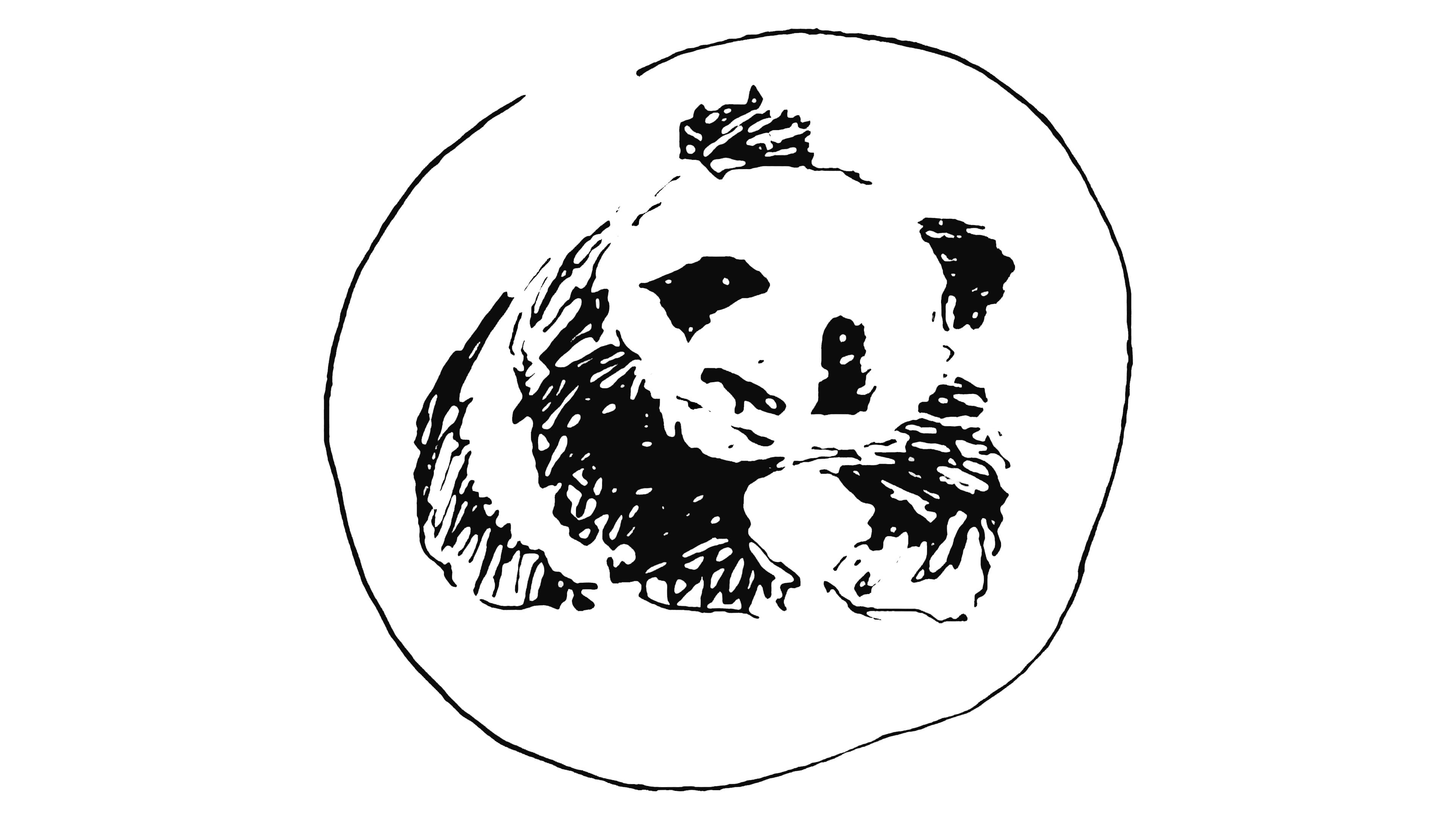
In this particular case, we're talking about the top half of the graphic-- the bear's back and head. It's really not there, is it? The white space around the logo invades the interior of the space, and some of those black shapes for the eye patches and ear are just floating in space, aren't they? Well, they are, technically-- but no, they're not. Your brain sees them exactly where it thinks they should be, because it's 'closing' those incomplete shapes, and seeing it as an entire bear.
Take, for example, this shape to the right. You still see a bear, right? Well sure, you're conditioned to it now. But try to see it as JUST A BLACK SHAPE, and not as the thing with the white and black areas. Try covering up the 'ear' part, or squinting your eyes until you no longer see the mouth. Slowly, but surely, you start to see this round black shapes. They kind of look like talons or bird claws or something. Maybe. But you're no longer seeing a bear. Well that's what makes this logo so successful-- with a few well placed, well-drawn objects of single color line art, the designer created the perfect illusion of very recognizable and familiar animal. It just works, and the more you look at it, the more you continue to admire the solution of it all. And you certainly don't forget it.
What do you all think? Is it interesting? Is it memorable? Does it represent what you think it should be? How would you have solved this differently?
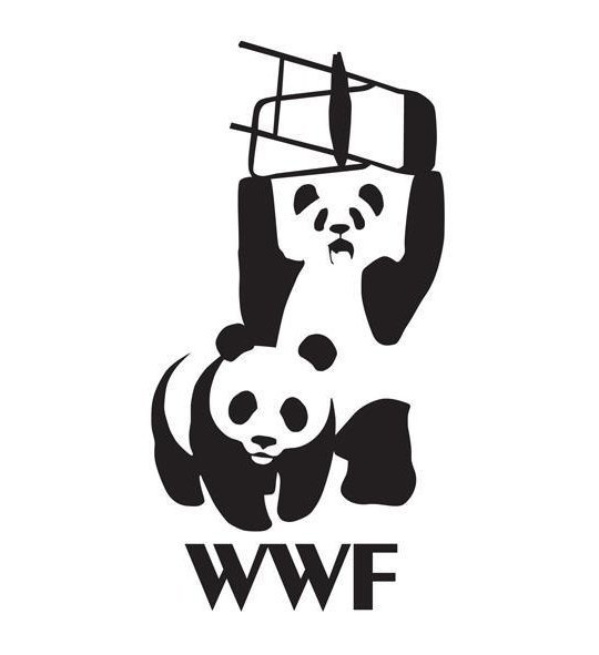
Or are you just an old school wrestling fan that resents this organization and what it meant for Vince McMahon's business model? If that's the case, I'll leave you with this fairly fun tee design, which was obviously created as an inside joke for designers, wrestlers, or both:
Thanks for the interest!
Sources include: 1000logos.net, logodesignlove.com, pentagram.com, funny junk.com