
Country of Origin: USA
Industry: Ummm, Everything? (Let's just call it Entertainment)

Disney. Technically, its official name as a business entity is THE WALT DISNEY COMPANY. What started out as a fun little drawing of a dancing mouse on a riverboat by a struggling newspaper cartoonist is now easily one of the most recognizable brands in the world and is worth in excess of 350 billion dollars. It is also a proprietary giant, gobbling up and appropriating the most famous brands in entertainment (and often its competitors) with no end in sight. I won't go down the list of the famous brands and franchises we all love and how they have been incorporated into the Disney machine, but just know that however many you can think of, you're probably missing a few.
But how about that logo? What does "Disney" mean, now, and how much has the company fought to actually remove some of the brand attachment we all have with this famous name? Wait, what??
THE SIGNATURE
"Disney."
It's kind of a strange word when you look at it, especially as a designer or typography. Dis and Ney? It kind of reads like it should sound like "Disnay" or "Dis-neigh." It's actually an Irish name, brought over from the Green Isle by Walt's grandparents, to... Ontario, actually. Had Kepple Elias Disney not been convinced to buy land and try farming oranges in Kansas (yeah, I know, right?), we might all be traveling to Sudbury to visit Disneyland.
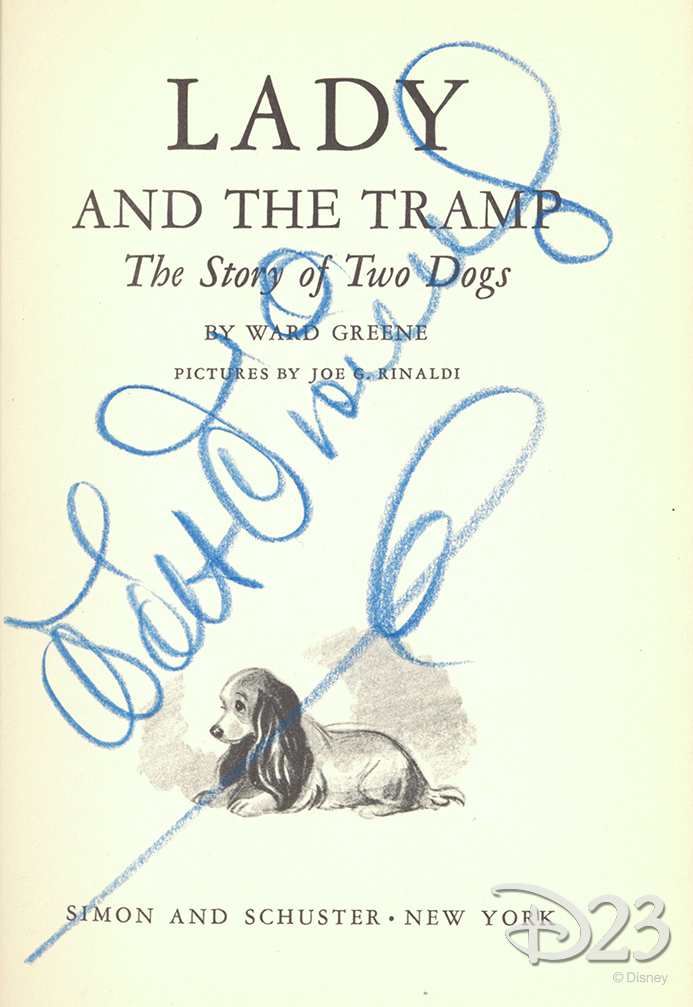
Like many famous people, Walt Disney's signature was rendered and recorded thousands of times, and as the prestige of the Disney Company rose, so too did the fame of his signature itself. Looking through a simple search, it's fairly interesting to note that Walt Disney's signature looks, well, very different at different times. I would think that the one here, a signature perhaps scored outside the gates of Disneyland itself, gives us the most honest look at his signature
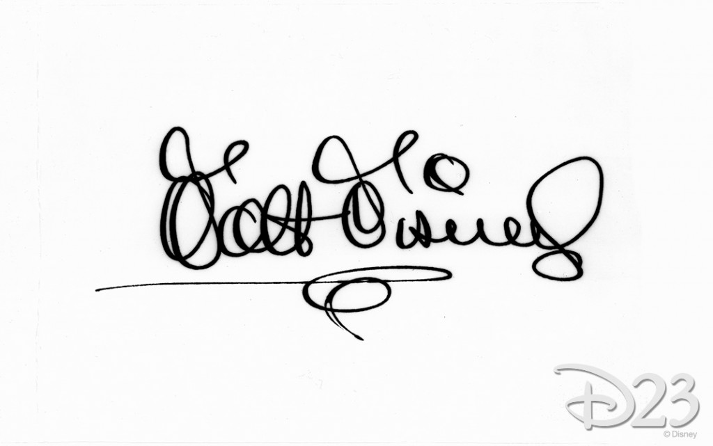
Obviously, it's quite different from what we all think of when we think of Walt Disney's signature.
So why the changes? If the logo we know and love and sometimes hate isn't his signature at all, well then, why is it even there? Well, take out a piece of paper and sign your own name. Take a look at it. How visually interesting is it? How legible is it? And perhaps the best question to ask is... do you sign your name to make it interesting, or to get it done as quickly as possible?
Here's a good look at Walt's John Hancock in black ink on a white ground for optimal contrast. Can you even read the words "Walt" or "Disney?" Probably not.
However, Disney was also a cartoonist, and artist signatures ARE more proprietary things that can become a sort of brand within a work of art. As an artist myself, I can assure the signatures I drop into an illustration or other hand drawn piece are usually much more visually appealing that the signature I slap on a check for my niece's birthday.
At any rate, when the decision was made to use Walt's signature as the icon for his entire enterprise, in a sense it no longer was his. Remember, at its inception Disney was an entire studio of artists, so I'm sure his scripted name was developed and refined into a more pleasing standardized appearance. It's worth wondering if Walt himself even had a hand in his own signature word mark. Over the years the style has changed, sometimes departed from what scribbly icon we know today, then returned, slowly but surely evolving into a perfectly sculpted organic treatment that is more art than personal stamp.
EXTENSION
Sometime between the 60's and 80's, the Disney Company emerged as the de facto brand for family entertainment, offering animated films, shorts, weekly television shows, the two premier theme parts of the United States, and merchandising of all sorts and shapes. Disney was beginning to make lots and LOTS of money... and the Disney word mark was along for the ride at every stop. It was also standardized, which is always a good thing in branding. It's absolutely imperative that any brand's logo or word mark ALWAYS LOOKS THE SAME ALL OF THE TIME. It's what builds upon every viewer's experience and emotional attachment to that brand, and increases its recognizability with every exposure.

As the Disney empire began to grow, the logo added several extensions or sub-brands to the identity system. Brand extension is a term that describes the act of adding additional products or sub-brands related to an existing brand, with the extent of carrying over some of the existing equity or association of the original. It's why companies like Coca-Cola roll out products like Cherry Coke or Coca-Cola Coffee, rather than just release them as new products. If you have a proven winner, it's never a bad idea to attach new products to your existing brand than trying to launch them as new altogether.
In the case of Disney, the onset of all of these new imprints— everything from theme parks to studios to cable networks—saw the Disney word mark attached to all of these ventures. This isn't a bad thing, mind you— with such a dedicated following, using anything other than your existing name would be a failed opportunity to grasp their attention with each consecutive new rollout. But in terms of graphic design, look above.
What you're seeing with all of these sub brands are all of these additional graphic elements for each new venture. Castle icons, mouse ears, mouse sorcerer apprentices, mouse this, mouse that... yes, it's all the same idea, right? Mickey or the Park or some combination of both. Yes, it's all the same in concept-- but visually speaking, it all starts to look different. And do you see how the "Disney" name starts to get lost in all of it?

As a logo itself, in pure examination, the Disney word mark is kind of an odd bird. It shouldn't work, really. It's all capitals and yet it's whimsical; It's not as readable as it really should be, and some of those variations in like thickness create some bad design proximities. That swirl in the middle of the "S," for example, feels like it should be problematic. But it's not. It all works. It's all exactly where it should be, and it has SO MUCH CHARACTER.