
COUNTRY OF ORIGIN: USA
INDUSTRY: Food
I'm not gonna dive too deep on the history assessment this week. Apparently the brand has been around since 2018, and the whole '31' marketing gag has been around since, well, before marketing was even a thing. These old logos are pretty strange though-- it's amazing how you need that 'Ice Cream' in there just to establish what the heck it is. The old cowboy fonts and inclusion of brown probably were there to suggest chocolate, strawberry and vanilla, but without the "Ice Cream" spelling it out, they kind of look like old stock car graphics from the 50's or something. Very bizarre.
The current logo was rolled out in 2006, and it's this one that I'm going to focus my attack. I mean, my review.
WHAT I LIKE
Ummm, the colors, I guess?
This logo is one of those ones that always show up on those "clever logos" lists that people outside of the business seem to throw together for, well, reasons.
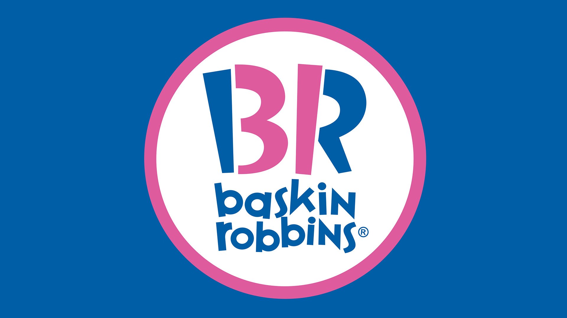
I do like the colors. They're unique the pink does contrast quite well with the blue. It would seem that Baskin Robbins has been partnering some shade of blue with a bubble gum pink for some time now. It makes sense; the colors feel whimsical and candy like, and they just sort of scream treat or sweet. "I scream for ice cr--" okay okay, I'll stop now.
But yeah, beyond that... this isn't one of those type of appreciative posts.
WHAT I DO NOT LIKE

Yeah, yeah, the B and the R have a "31" inside them. It's supposed to be one of those "hidden logo finds" that people who don't really understand branding think is smart and well executed. I'd counter that this thing is about as hidden as a 40 foot crater suddenly opening into the earth on your front lawn, but I suppose I don't see these things quite the same as others, so maybe it's just me.
It just feels over the top and way too "trying to be clever" for my taste. It's right there and not at all missing or low key, and I would go so far to say it actually betrays itself in terms of functionality, and I'll tell you why.

And don't even get me started on that crazy typeface for the name. the "K" in baskin really bothers me, and it looks like they're trying to look both fun and youthful AND yes, again, clever, all at once, and as a result it doesn't really feel like any of those things. I'm not opposed to the bouncing baseline here-- a baseline is the imaginary line typography rests upon, and in this case it's been sacrificed to look all bouncy and haphazard in its attempt to look "fun" and/or "clever." It's just another thing they have going on here. Too much salt can ruin the soup... and this is some salty broth if you ask me.
Maybe it's just me. Maybe I am focusing too much on my own unique perception of the colors and the type, and assuming that's how others see it. Maybe I've always kind of just hated the name because my last name is "Robbins" and I've had more than my share of funny guys growing up who thought they were the very first person to ever consider calling me "Baskin." You know, because they thought they were.... wait for it... "Clever."
But I think this logo is far too cute for its own good, and it kind of gets on my nerves. What do you all think? Anybody wanna go get some Haagen Dasz?
Sources include: BaskinRobbins.com, 1000-logos, logosworld.net, Wikipedia