Featured Post

WELCOME TO LOGO INSPECTOR! (Please Read)

5.21.2021

CASE STUDY: CHANEL

COUNTRY OF ORIGIN: FRANCE

INDUSTRY: FASHION


Hey friends, everyone's favorite logo inspector here with a quick look this week at one of the more iconic logos in the fashion world, if not the world itself. Yes, it's CHANEL. Forgive me if I seem more surprised at the story behind this brand than some of you, but fashion isn't necessarily my thing, and if it is yours, that's cool too.

But yes, Chanel as a brand was the brainchild of Gabrielle Chanel, better known to history as "Coco Chanel." I thought this was some long story about socialites and children of some magnate putting gobs of capital into their fashion pet projects, and I couldn't have been more wrong. Ms. Chanel grew up in obscurity and relative poverty, and was very much a self-made women. She moved to Paris in the first decade of the 20th century and worked as a seamstress while moonlighting as a cabaret singer at night. One of the more famous songs she sang to soldiers was a song called "Who Has Seen Coco?" In time, it became her nickname, and it stuck when she went on to create her own brand of clothing. Far be it from me to rattle off her historical importance to that industry, but I will say that she built the brand herself by innovating fashion itself, establishing the famous women's Chanel suits, the "little black dress," and of course her famous fragrance, "Chanel No. 5."

THE LOGO

The logo is one of the staples of style and prestige and fashion in the modern Western world, and it's one of those designs whose aesthetic merit and flare are less important than the tradition it carries. Ms. Chanel designed the mark itself, and its two interlocking "C's" obviously stand for her inherited first name and her born surname. There's some interesting interplay between foreground and background within those C's— the more I look at it, the more I start seeing that white, almost almond shaped "thing" in the center, and those two fishtail forms reaching in at either side. But for the most part, it's fairly basic. But, as we've discussed before, in the branding world, there's nothing at all wrong with that.

I love the symmetry. We're symmetrical objects, we people. Have you ever noticed how things that look the same on one side as the other just tend to catch your eye, feel right, feel like that's intuitively how they should be? There's a lot of great articles and studies out there about why human beings crave symmetry in the world around them, how we finding it relaxing or reassuring, and how it reinforces some subconscious desire for order and meaning in the world around us. What's interesting about symmetry in design is it automatically creates this sort of quality control or fact-checking function inside us. You see one side a certain way and almost reflexively your eye drifts to the other side to confirm that it is the same. It's like it automatically triggers the Logo inspector in all of us!

We've also discussed here in previous posts the idea of gender in graphic design. Some designs feel more masculine, and some more feminine. So obviously, a logo for a woman's fashion empire would intuitively be designed as feminine and soft and gentle, right? The answer, of course, is no. This logo is bold, strong, geometric, and balanced, and features a strong, widely stances set of letters to depict its name. Why is that?

I read in this article that Ms. Chanel was originally inspired by a set of ornate windows in a home she lived in as a child, but she did not create the logo until 1925. As a designer and something of a student (and teacher) of the history of graphic design, there are some historical cues that we might follow to see her train of thought in this mark's creation. For example, it's not that feminine stylings in design had not been cultivated at this time; quite the opposite. The Art Nouveau style of design, featuring organic lines and feminine beauty, had already had its day in the sun, peaking somewhere around 1910 or so. At that point, Ms. Chanel was in Paris, of all places, so I'm sure it was all around her and had become the standard for advertising, packaging, and design in general. In other words, it had become status quo.If you might think that this would be the perfect aesthetic styling for a fashion designer trying to make a mark with women's dresses and styles at the dawn of the Roaring 20's, you may be predictably right. And I'm sure that's why Chanel did NOT go this route.

The 20's saw the emergence of several ideologies of design in art, architecture, and yes, advertising. Art Deco had arrived in Paris by this time, featuring strong, clean, sharp lines that implied power and industry. Likewise modernism was evolving rapidly, featuring simplistic interpretations of the real world that focused less on recreating reality and more about interpreting it in a new aesthetic way.

I would think that all of these factors led Coco Chanel to create her logo the way she did; as a departure from the old, as something bold and masculine, as an almost abstract symbol that became its own visual point of reference. Its roots lie more in traditional French Art Deco (what you and I think of as "Art Deco" probably lies more in the American reception of the Art Deco style, i.e. the look of skyscrapers and Ayn Rand cityscapes and vintage Superman cartoons, etc). But yet there's more to that Chanel logo than that. There's something very abstract in its simplicity, almost suggesting that you should be trying to "see" something in those interlocked C's that isn't actually there. 

TYPOGRAPHY

The typeface is available today, I've seen clones called "Chanel" and "Couture" and a few others that essentially exist to capture the design decisions that went into the Chanel name. But the original typography in the branding was a hand drawn typeface that was just following modern aesthetics; a bold, broad-columned sans serif faces was hardly unique in that window of time, but it was fresh and new and helped channel a sense of something stylish and modern.

What's amazing is that over the next fifty years that same art direction of the Chanel brand, and even Coco Chanel herself, became a standard of timeless style and sophistication as a result of the products that were associated with it. You can see here as these advertisements evolved from the 20's into the 60's, the design remained consistent, but just FEELS more and more substantial as they pass down through time. As I've said in the past, graphic design can be created to invoke many things, but tradition can never be invented.


In the end, it's a great example of how a brand, a logo, even just a name, can have decades of equity and user appreciation attached to it. The style or the design decisions really aren't as important as the product and its emotional and material value to the user, which is almost funny to hear myself say because as a designers and artists, we're constantly trying to tell ourselves otherwise. 


In any case, the Chanel brand is one of the more famous ones in the landscape of logos, whether you're a fashion person or not. I love how simple icons like these become a part of the visual vocabulary of our civilization that transcends individual countries, languages and societies. Simple shapes like the Chanel C's or, say, the golden arches become archetypes that we just recognize, regardless of who we are. It's almost like these logos are as integral to the human condition as letters or numbers. Or maybe I just think about this stuff too much.

What do you guys think? Leave comments on the Twitter page! I'd love to hear some feedback. Thanks!

Sources include: Wikipedia, Medium.com, bbc.co.uk, etc

5.13.2021

CASE STUDY: BASKIN ROBBINS

COUNTRY OF ORIGIN: USA

INDUSTRY: Food

Yes, of course, it's the Baskin Robbins logo. If you live under a rock or perhaps above the Arctic Circle, you may not be familiar with the brand, but Baskin Robbins is an ice cream franchise. Their tagline and marketing gimmick is "31 flavors," which basically revolves around what was once a novel concept that while most ice cream shops would offer you vanilla, strawberry, chocolate and perhaps a few rotating flavors, Baskin Robbins would always have 31 choices, setting them apart and perhaps attracting customers solely for its promise of variety and choice. Why 31? Well, apparently the number is meant to suggest you can go there "every day for a month and not have the same flavor twice." Not a bad idea, I suppose— it suggests repeat visits and almost feels like a dare in advertising form.

HISTORY


I'm not gonna dive too deep on the history assessment this week. Apparently the brand has been around since 2018, and the whole '31' marketing gag has been around since, well, before marketing was even a thing. These old logos are pretty strange though-- it's amazing how you need that 'Ice Cream' in there just to establish what the heck it is. The old cowboy fonts and inclusion of brown probably were there to suggest chocolate, strawberry and vanilla, but without the "Ice Cream" spelling it out, they kind of look like old stock car graphics from the 50's or something. Very bizarre.

The current logo was rolled out in 2006, and it's this one that I'm going to focus my attack. I mean, my review.

WHAT I LIKE

Ummm, the colors, I guess?

This logo is one of those ones that always show up on those "clever logos" lists that people outside of the business seem to throw together for, well, reasons.

I do like the colors. They're unique the pink does contrast quite well with the blue. It would seem that Baskin Robbins has been partnering some shade of blue with a bubble gum pink for some time now. It makes sense; the colors feel whimsical and candy like, and they just sort of scream treat or sweet. "I scream for ice cr--" okay okay, I'll stop now.

But yeah, beyond that... this isn't one of those type of appreciative posts.

WHAT I DO NOT LIKE


Yeah, yeah, the B and the R have a "31" inside them. It's supposed to be one of those "hidden logo finds" that people who don't really understand branding think is smart and well executed. I'd counter that this thing is about as hidden as a 40 foot crater suddenly opening into the earth on your front lawn, but I suppose I don't see these things quite the same as others, so maybe it's just me.

It just feels over the top and way too "trying to be clever" for my taste. It's right there and not at all missing or low key, and I would go so far to say it actually betrays itself in terms of functionality, and I'll tell you why.

Typography is about delivering information using familiar shapes that our brains already recognize. You take a "C," "A," and a "T" and arrange them in a specific order in ways that relate to each other and the viewer's brain sees an animal that meows. But those letters do need to work together. If you start to manipulate those letters or the relationship between them, you also risk changing the viewer's perception of them. If you look at this example here, the first word clearly reads "CAT." the second is less successful, in part because of the atrocious letter spacing. Does the T below with the CA, or is it doing something different? And finally, in the last example, the C is a different color, creating segments of relation your eye as the viewer. You don't see it as C-A-T, you see C and then an A-T beside it. The use of color can seriously hamper the effectiveness of typography. My daughter loves to write words on cards or or notes with every letter a separate color, and what she doesn't realize is, well, it doesn't look like a name, it looks like a collection of letters. The unity breaks down. Gestalt relationships unite visual elements into core ideas, and color variety in the letterforms is usually a gestalt killer.

When it comes to our OH SO CLEVER BH gimmick here in the Baskin Robbins logo, you're actually seeing such a breakdown in the letters themselves. Both the B and the R are segmented, and the segments are colored in such a way to unite the 31... but not the B and R so much. The 31 is visible and apparent because the pink ties them together, but for that same reason I think the BR thing doesn't work. The more I look at those letters, the more I don't even see the BR. What's the name of this place, 31 Flavors?

And don't even get me started on that crazy typeface for the name. the "K" in baskin really bothers me, and it looks like they're trying to look both fun and youthful AND yes, again, clever, all at once, and as a result it doesn't really feel like any of those things. I'm not opposed to the bouncing baseline here-- a baseline is the imaginary line typography rests upon, and in this case it's been sacrificed to look all bouncy and haphazard in its attempt to look "fun" and/or "clever." It's just another thing they have going on here. Too much salt can ruin the soup... and this is some salty broth if you ask me.

Maybe it's just me. Maybe I am focusing too much on my own unique perception of the colors and the type, and assuming that's how others see it. Maybe I've always kind of just hated the name because my last name is "Robbins" and I've had more than my share of funny guys growing up who thought they were the very first person to ever consider calling me "Baskin." You know, because they thought they were.... wait for it... "Clever."

But I think this logo is far too cute for its own good, and it kind of gets on my nerves. What do you all think? Anybody wanna go get some Haagen Dasz?

Sources include: BaskinRobbins.com, 1000-logos, logosworld.net, Wikipedia

5.07.2021

CASE STUDY: THE DISNEY COMPANY

 Country of Origin: USA

Industry: Ummm, Everything? (Let's just call it Entertainment)


Disney. Technically, its official name as a business entity is THE WALT DISNEY COMPANY. What started out as a fun little drawing of a dancing mouse on a riverboat by a struggling newspaper cartoonist is now easily one of the most recognizable brands in the world and is worth in excess of 350 billion dollars. It is also a proprietary giant, gobbling up and appropriating the most famous brands in entertainment (and often its competitors) with no end in sight. I won't go down the list of the famous brands and franchises we all love and how they have been incorporated into the Disney machine, but just know that however many you can think of, you're probably missing a few.

But how about that logo? What does "Disney" mean, now, and how much has the company fought to actually remove some of the brand attachment we all have with this famous name? Wait, what??

THE SIGNATURE

"Disney."

It's kind of a strange word when you look at it, especially as a designer or typography. Dis and Ney? It kind of reads like it should sound like "Disnay" or "Dis-neigh." It's actually an Irish name, brought over from the Green Isle by Walt's grandparents, to... Ontario, actually. Had Kepple Elias Disney not been convinced to buy land and try farming oranges in Kansas (yeah, I know, right?), we might all be traveling to Sudbury to visit Disneyland.

You've probably grew up being taught or gleamed on your own that the Disney word mark is the signature of Walt Disney himself. A word mark is quite simply a logo or brand asset that renders the business name in a specifically aesthetic way. Basically the name serves as the logo itself. But in this case, the specific graphic style being used to present the name is the hand drawn style of Walt Disney's own signature, right? Well, actually, not quite.


Like many famous people, Walt Disney's signature was rendered and recorded thousands of times, and as the prestige of the Disney Company rose, so too did the fame of his signature itself. Looking through a simple search, it's fairly interesting to note that Walt Disney's signature looks, well, very different at different times. I would think that the one here, a signature perhaps scored outside the gates of Disneyland itself, gives us the most honest look at his signature

Obviously, it's quite different from what we all think of when we think of Walt Disney's signature.

So why the changes? If the logo we know and love and sometimes hate isn't his signature at all, well then, why is it even there? Well, take out a piece of paper and sign your own name. Take a look at it. How visually interesting is it? How legible is it? And perhaps the best question to ask is... do you sign your name to make it interesting, or to get it done as quickly as possible?

Here's a good look at Walt's John Hancock in black ink on a white ground for optimal contrast. Can you even read the words "Walt" or "Disney?" Probably not.

However, Disney was also a cartoonist, and artist signatures ARE more proprietary things that can become a sort of brand within a work of art. As an artist myself, I can assure the signatures I drop into an illustration or other hand drawn piece are usually much more visually appealing that the signature I slap on a check for my niece's birthday.

At any rate, when the decision was made to use Walt's signature as the icon for his entire enterprise, in a sense it no longer was his. Remember, at its inception Disney was an entire studio of artists, so I'm sure his scripted name was developed and refined into a more pleasing standardized appearance. It's worth wondering if Walt himself even had a hand in his own signature word mark. Over the years the style has changed, sometimes departed from what scribbly icon we know today, then returned, slowly but surely evolving into a perfectly sculpted organic treatment that is more art than personal stamp.


EXTENSION

Sometime between the 60's and 80's, the Disney Company emerged as the de facto brand for family entertainment, offering animated films, shorts, weekly television shows, the two premier theme parts of the United States, and merchandising of all sorts and shapes. Disney was beginning to make lots and LOTS of money... and the Disney word mark was along for the ride at every stop. It was also standardized, which is always a good thing in branding. It's absolutely imperative that any brand's logo or word mark ALWAYS LOOKS THE SAME ALL OF THE TIME. It's what builds upon every viewer's experience and emotional attachment to that brand, and increases its recognizability with every exposure.


As the Disney empire began to grow, the logo added several extensions or sub-brands to the identity system. Brand extension is a term that describes the act of adding additional products or sub-brands related to an existing brand, with the extent of carrying over some of the existing equity or association of the original. It's why companies like Coca-Cola roll out products like Cherry Coke or Coca-Cola Coffee, rather than just release them as new products. If you have a proven winner, it's never a bad idea to attach new products to your existing brand than trying to launch them as new altogether.


In the case of Disney, the onset of all of these new imprints— everything from theme parks to studios to cable networks—saw the Disney word mark attached to all of these ventures. This isn't a bad thing, mind you— with such a dedicated following, using anything other than your existing name would be a failed opportunity to grasp their attention with each consecutive new rollout. But in terms of graphic design, look above.

What you're seeing with all of these sub brands are all of these additional graphic elements for each new venture. Castle icons, mouse ears, mouse sorcerer apprentices, mouse this, mouse that... yes, it's all the same idea, right? Mickey or the Park or some combination of both. Yes, it's all the same in concept-- but visually speaking, it all starts to look different. And do you see how the "Disney" name starts to get lost in all of it?


EVOLUTION

Obviously, the corporate growth and evolution of the Disney Company could be its own case study in and of itself, and an exhausting one at that. But, to make a long story short, by the turn of the century and into today, Disney as a business has become a massive empire, spearheaded first and foremost by its entertainment. Disney Pictures and the new Disney Plus are some of the heaviest hitters in the world, and rightfully so with the investments they've made (cough, Marvel, Star Wars, 20th Century Fox, etc).


But that's where it gets interesting. As the  the Disney Company has made all of these astronomically wealthy additions, I believe what we're seeing is a change to its core mission as a company. And there is a conscious decision to reflect that in its brand identity. You probably don't need to look hard at that Disney Plus logo-- in the course of about 18 months it's become as instantly recognizable as any other brand on your TV or mobile device, and I'm sure you know it well. But what don't you see?

There's no magic castle, or mouse ears, or anything like that. There's none of the things that made Walt Disney the man into Walt Disney the Brand. In fact, I'd go so far to say that in recent years the Disney Company is consciously trying to subtly distance itself from all of that. Why do you think that is?

Well, I suppose it's because Disney is no longer just Mickey Mouse. It's also Darth Vader, and Iron Man, and Bart Simpson, and ESPN and Indiana Jones. Quite simply, The Disney Company has transcended its own "Disneyness." Disney is now much more than everything we grew up thinking Disney was, and intelligently enough, its branding stewardship had to recognize and accommodate that.


Could you imagine the epic text crawl at the beginning of the next Episode of Star Wars being preceded by a mouse walking across the screen? Or the next Spider-Man movie being heralded as a part of the "House of the Mouse?" No, of course not. It would be bad for the brand, and it would be bad for business. Disney is, quite simply, no longer just about the mouse. Or perhaps a better way of saying it is... the Mickey Mouse side of Disney is now just one of the brands of Disney, and probably not its most popular one at that.

Which is why it all leads back to....

THE WORD MARK


As a logo itself, in pure examination, the Disney word mark is kind of an odd bird. It shouldn't work, really. It's all capitals and yet it's whimsical; It's not as readable as it really should be, and some of those variations in like thickness create some bad design proximities. That swirl in the middle of the "S," for example, feels like it should be problematic. But it's not. It all works. It's all exactly where it should be, and it has SO MUCH CHARACTER.

Why? Why does it work as a logo?

Because of your history with the brand. And mine. And every single person on the planet who was first exposed to it as a child and has always associated it with wonderful feelings and ideals. Things like innocence, and the power of imagination, and good clean fun. These are the things that the Disney brand has always meant to us, and our parents and perhaps even their parents.

There's no inventing tradition in branding, and Disney has plenty of it.

Not bad for a cartoonist from Kansas City, right?

What do you guys think? What does the Disney brand mean to you? And what do you think it'll mean to your children, in the age of Marvel and Star Wars and who knows whatever else they might appropriate in the years to come? Does Disney mean something else to you today than it did 20 years ago?

Sources include: D23, Wikipedia, LogoMyWay, cord cutters, disney.com

4.29.2021

CASE STUDY: The National Football League Shield Logo

Country of Origin: USA

Industry: Football

Today marks the beginning of the NFL's 2021 Draft, which has become nothing short of a sort of holiday and is as prime-time mandatory viewing as the Super Bowl itself among football diehards. (Personally I prefer when it just took place over the course of one weekend, but that's just me.) As such, I thought it was a fine time to take a look at the logo of the NFL itself, a mark that carries all the legitimacy of the corporate giant in one compact, instantly identifiable graphic.

HISTORY

From what I can gather, the familiar shield we basically associate with came about sometime in the 30's after the the NFL had started to establish itself as a viable league. You can see that even in that early striped version, the basic building blocks were there. The nicely packaged evolution graphic here (courtesy of the great Todd Radom) doesn't include all of its iterations— there are a few more variants, and I'd suggest heading over to Chris Creamer's logo site if you want to see more.

But you can see that all of the basic pieces are in place. The shamelessly patriotic shield, which was probably much more commonplace of a thing in the 30's than it is today is there, as is the football, and the stars, and the acronym of the league itself, the National Football League.

You'll notice that the stars vary greatly. It seems like there's more, and then there's more... and now there's only 8? Well, the stars used to signify each individual team in the league, and that in and of itself is problematic. By making such a choice, you create a logo that actively features components that are in flux. Sports leagues grow, and add teams, and occasionally subtract them. The NFL had a situation where the logo had to be redesigned every time a new team was added, and often with painfully non-symmetrical results. So for the most recent update, developed by the league itself in 2008, the choice was made to reduce the stars to 8— one for every division. The solution should prove to be less volatile and prone to change, plus it looks cleaner. Any good artist can tell you all those stars would prove to be a nightmare in cases when the logo would have to be reduced in size, or rendered in embroidery, etc. The 8 stars are clean and offer much more consistency in reproduction.

The other biggest change we see, and the one that surprised me the most in 2008, was the changing of the typeface. I always loved the old, throwback serifed letterforms of the NFL logo I grew up with, the curved stem on the bottom of the F, and of course that lustrous swirling L. That type of L is what typographers might call a teardrop lacrimal or teardrop terminal, and probably saw its start with calligraphers in the Middle Ages who wanted to "end" their letters without sloppy finishes or exits.

For me, even as a kid, that teardrop on the end of the "L" was a vital piece of visual DNA in the NFL logo, but the league chose to scrap it. It is a bit busy, and does get very close to the column of the L. Perhaps they did some testing with younger viewers who thought it looked a bit too much like a lowercase "b." But for whatever the reason, they simplified the acronym, and used a more squared, chiseled typeface. It still fits the personality of the brand, if not discarding some of the obvious visual history. And, truth be told, that might have had some say in the decision as well.

It's also worth noticing how the orientation of the football changed in the 2008 revamp. This is very clever design work, as it's a visual nod to the Lombardi Trophy itself, awarded to each year's Super Bowl winner. See how the new angle and vector treatment of the ball is styled to remind you of the prize at the end of the road. I love how the design team basically reworks the NFL's own mythology into itself like this. A very strong change that's worth the entire rollout of a new brand, in my opinion.

A SHIELD

The NFL's official mark is instantly recognizable. If you're in any way used to seeing this thing, you can see it anywhere and know exactly what it is and dial up whatever emotional attachment you have to American professional football. But what exactly is it about this thing that makes it so unique?

Trying my best to remove my own lifelong connection to this brand, I'll try to approach it simply as a design professional and try to pretend I've never seen it before. So, looking at this thing in terms of pure aesthetics, the shape of the mark stands out. Yes, it's a shield, and this shape of a shield obviously goes back centuries in western civilization-- and yet, for the latter half of the 20th century and up until today, the NFL mark has basically appropriated this shape. When you see this shape, even if you're at Medieval Times or your local Renaissance Fair, you probably think about football, which says a lot. It's probably worth considering that there's some latent or subconscious connection with shields and war and masculinity, but that might be reaching a bit deep. But make no mistake, you're not going to see the Hallmark Movie Channel using a strong shield silhouette anytime soon.

The shield as a shape is bold and has a lot of sharp angles, across the top, the point at the bottom, etc. Its aggressive points boldly stab at the surrounding white space, and that creates visual interest. It's also extremely symmetrical, which implies balance, trustworthiness, and order.

Those protruding outside features also propose problems for designers handling this mark and inserting it into clean design. I believe I have mentioned before what I refer to as a logo's footprint— basically, the horizontal and vertical real estate it must take up in any design. If you look at the graphic to the left, you'll see how much vertical white space outside the logo is basically used up because of the sharp points at the top and the bottom. Well, who cares, right? Well, designers care, especially NFL designers, because let's say there's a spot on a web page for these graphics, and it's only, say, 100 pixels tall. Well, because of those exterior points, the entire footprint must be squeezed into those 100 pixels, and as a result, the core elements of the logo may only take up about 80 to 85 pixels.

Imagine, let's say, that you want to put your car in a garage. But for whatever reason, you decided to add some tail wings to your car. Now, the main part of your car would fit in that garage perfectly, but those wings make it a much more precarious fit, or perhaps it just can't get in there as a result. So your options are to pay for a larger garage, or hypothetically "shrink" the entire car to fit inside. That analogy kind of breaks down at the end, haha, but I think you get the idea.

MASCULINE

This thing is all about STRONG, TOUGH, CLEAN, BOLD lines and elements— The chiseled typeface, the super clean vector football rendered in one color, the white stars contrasting against that blue ground— all of this is some conglomeration of toughness and patriotism that appropriately screams "American Football!" This is all about audience. Graphic artists can and do influence the connection between brands and its viewers by using design cues that resonate with portions of the public that their clients intend to connect with. I'm sure you've all heard the term target audience before, and branding professionals develop iconography that helps build those connections.

Some of my past students have had struggles understanding the concept of gender in design. For example, one student thought that creating masculine or feminine designs basically boiled down to using pink or blue in his palette. But there are lots of ways logos can be rendered to look more male or female. Feminine designs can feature more graceful lines, curved and elegant, as opposed to bold and strong. Colors might be used, but not in such glaringly presumptuous ways as mentioned above— for example, masculine designs tend to use colors that create contrast and visual punch, where more feminine works might employ more subtle or complex color combinations.

However, if an artist really want to pronounce gender in a logo, typically the easiest way to do so is in typeface selection. Typography styles naturally create the illusion of voice and personality as aesthetic elements in design. The fonts you choose can make designs feel angry or funny, happy or sad, frenetic or bored, and yes, male or female.

These are deodorant products from the same brand, Nivea. Notice the differences in colors, typography, and even design elements. It's even worth noting how 'masculine' the Nivea mark itself is, especially on the women's deodorant package, because everything else is designed with a more feminine flair.


For the sake of illustration, I prepared this "alternate" NFL logo. The colors are softer, less primary. Those jagged exterior elements are rounded, smoother. And I chose a typeface that is scripty, flowing, lowercase (UPPERCASE TEXT ALWAYS APPEARS LOUDER AND MORE MASCULINE), and even on a baseline skew or oblique. Does this feel tough to you? Do you think this brand would connect with all those guy's guys who wake up on Sunday mornings in the fall lining up their beer and nachos for a long day in front of the TV?

NOTE: Please, by all means, I am in no way implying that women cannot be tough, bold, strong, aggressive, or any of those things. All I'm saying is these design cues focus on triggering perceptions in audiences, and, quite simply, they work. I am in no way saying that I am a traditionalist or would ever tell any woman what she can or cannot be. I'm just illustrating how brands make their connections with their audiences.

CONCLUSION

The NFL shield is an instantly recognizable mark that calls upon decades of brand equity and association with its loyal, fervent fan base. One thing most sports leagues do well is use their league logo in conjunction with individual teams. Yes, you might be, say, a Packers fan, but you're not going to buy a Green Bay jersey unless it has that NFL shield on the collar. Even more so, what self-respecting Packers fan would want to buy a jersey without the NFL shield?


See, what they're doing there is using the league icon as an element of authenticity. In other words, it's not the real thing unless it has their mark on it, their seal of approval. I'm making it sound foolhardy, but that stamp of authenticity is worth millions and millions of dollars in licensing revenue, and plenty of apparel and product partners pay dearly for the right to slap that shield on the things they turn around and sell to the loyal team fans. Smart business, and smart branding.

What do you all think? Does the NFL shield really mean that much to you? Or is it something that's just there, and you tend to forget about it once the game starts? (Trust me, you don't.) 

Sources Include: NFL.com, Todd Radom, sportslogos.net, Wikipedia, Amazon

4.22.2021

CASE STUDY: FIRST LOOK! Cincinnati Bengals New Uniforms

 COUNTRY OF ORIGIN: United States

INDUSTRY: Football

"This is the LOGO INSPECTOR. LOGO, man, not JERZEEEES!"

Yes, this is true, football jerseys are not logos. However, uniforms, on sports teams and even in corporate or retail environments, ARE a form of branding, and they can and do shape consumers' opinions and ideas of what a brand is. When it comes to sports, uniforms are extremely important, not only in a sense of visual identity, but also as a major source of income. We've grown up in an era of sports where you show your sense of pride for the team by... buying a hat, or a jersey, or everything under the sun. Heck, I have enough Michigan gear to cover me from head to toe several times over.

WHY APRIL?

This week the Bengals unveiled their new uniform designs, brought to you by the team sports group at Nike. If you weren't aware, April is typically the most popular month for new uniform unveils in the NFL, because the NFL Draft is held at the end of April, and most teams like to trot out their new draft pick in a shiny new jersey, also available in a matter of minutes on the team's online store for a hefty little price.

SOME HISTORY

The Bengals began their not-quite-illustrious history in 1968 as part of the new hybrid NFL, their inception in part to balance out the number of squads on both the AFL and NFL sides. There was once a wartime-era football team in town called the Bengals, and the Cincinnati Zoo had some famous tigers at the time, so the name stuck.

The original logo set, was... well, it was a football uniform, I guess. These things had no identity, obviously. I seem to remember reading somewhere that owner Paul Brown, once head coach of the Browns, perhaps chose the same shade of orange for his new fledgling team because he owned all their gear, and actually took it south with him to Cincinnati. I once read that prototypes exist of a turquoise and gold look, but that obviously didn't fly.

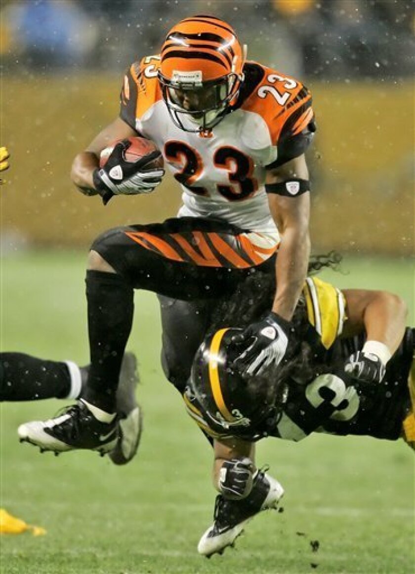
Seen here is former Bengal Kenny Anderson in the largely forgettable look. I don't remember sitting through many Bengals games as a toddler back then, but I do remember the little plastic bubble gum machine helmets, and dropping a quarter just to get that ugly thing was something a consumer fear I can vaguely recall.

In the months leading up to the draft, chatter coming out of Cincinnati kept dropping words like "clean" and "classic" and "throwback," leading me to believe we were inevitably going to see the Bengals follow suit of their instate rivals the Browns. Cleveland dialed up a classic look out of the 80's, fan and critical response was overwhelmingly positive, and then the boys in the new threads followed it up with their most successful season in a generation. I figured we were certain to see the Bengals return to their classic Boomer Esiason look, seen here. If you ask me, ehhh. It's okay. The orange always seemed too dark, and it all just seems to focus on the helmet. 

To my surprise, the team did NOT do this, and instead rolled out what I think can best be described as a cleaner take on what they already had. Their old uniforms were a bit busy, but I've been on record as saying I didn't think they were that bad. They were busy, probably a sign of the times in 2004 when they were rolled out (shout out to Christ Creamer for making it so easy to find the date). Looking at them now, it's no secret that side panels... yeah, they reaaaaaally haven't aged that well. So it was time for a change. What I liked about this set was the ORANGE-- it really was allowed to star a bit more, and not just on the orange alternate jersey. Look how well the orange played on the away jersey, seen here from former Michigan great Chris Perry.

My biggest criticism of the Esiason era set was that the orange never really popped-- you'd watch a game on TV and it usually looked like it was just some random team in black and white uniforms, with some other color in there somewhere. So the 2004 set alleviated that. I always liked the numbers, too.

NO LOGO?


The Bengals started their history with no logo at all, just a plain name on the side of their helmet until 1981, when their famous striped helmet became their entire visual identity. It's still a winner, and I'm glad they didn't touch the helmet at all in the redesign. But when it came to logos, for a long, LONG time the only thing we saw was a vector illustration of that same striped logo.


There was a leaping tiger in there for a while, which I believe even made it to the jersey sleeves in the 90's, and then with the 2004 redesign came this tiger head logo. I've always liked it-- tiger logos are fun because the animal itself is very complex, so it becomes this exercise of simplifying the stripes and the expression without getting away from the source too much. I've always like this graphic and wish the Bengals would use it more; to my knowledge it's never actually showed up on a uniform design. And don't get me wrong, sometimes those "never actually on the uniform" is a sort of fun trend in sports altogether, especially in baseball, but for whatever reason this guy has always seemed under-utilized in my opinion. But it's hard to argue that the striped helmet has always been the star in the Bengals visual identity, and always should be.

THE UNVEIL

Fast forward to 2021, and the Bengals roll out their star quarterback and former number one draft pick Joe Burrow and his teammates in these:


FERNS, man. Seriously. It's literally become part of their identity, even showing up as venue graphics in their stadium. What's with Ohio football teams and vegetation, anyway?

I won't go into scrutinous detail, picture after picture. You've already seen the images and there are better sources to look at them, anyway. But, as a designer, and as a branding guy, I like what I see. These uniforms are clean, and they kind of got out of their own way and seem to have been planned to get down to the core, root idea of what they should be. It's a football team. It's based on a tiger motif. They're going back to basics. Most of it works fairly cleanly.

I liked the numbers the Bengals used in the last set, and they kept a similar numerical face here. They have character but they're not overwhelmingly complex, either. It's more about style that complexity, and I guess you could say that about the entire design.

If you're looking at it in the most basic, literal terms, as a designer you clearly see you have a great visual element to start with, and that's the appearance of a tiger, one of the more aesthetically stimulating animals on the planet. But as a designer, what I see as a problem, or perhaps a problem to solve, is the fact that the color relationships on a tiger's hide are very specific. The stripes are black. They exist on white, but the strong association most people have with them are on an orange background. When you think "tiger," the image you see is an orange cat with black stripes, of course. Colors and the relationships between them have a lot to do with context.

Okay, but now you're designing a football uniform for a team that has those colors, but want to use black as its primary base color. So how do you solve that problem? Going back to past uniforms, the artists employed shoulder yokes or panels to create areas of orange background upon which to place those stripes. Which, for their time, apparently worked. But in this latest round, it would appear the creative team were hell bent on keeping it simple, and that meant putting some stripes on the shirt but otherwise keeping it devoid of additional stripes, panels or insets. So, obviously, the stripes look great on the orange jersey. Very tiger-like. But how do you "solve" the black jersey? And, for that matter, the white jersey as well?

This is what being a graphic designer is like. You invent rules for your artistic vision, and then you have to figure out a way of working within the constraints of those rules while still developing a solution. As a designer, I love that word... because that's what we do. Jobs and logos are "visual problems," and the artist is tasked to solve those problems with some sort of creation. That's how I think and that's how I look at the finished work. So what did the designers do here in regards to the tiger stripe dilemma?

Well, obviously the simple template was the priority, and someone just made the decision to flip the context of tiger stripes. Orange stripes on a black shirt. Show me a tiger that looks like this in nature. You can't, of course (imagine how cool that cat would look, right?), but after some simple testing, I'm sure the decision was made that it just doesn't matter. Yeah, orange stripes, who cares? It still works. And it does.

After spending a few minutes looking through the galleries, your brain isn't even thinking about jungle cats or natural striping patterns. It just makes sense, and it solves the problem. Whether or not you see such a motif in nature seems irrelevant, because you're seeing it here on their uniforms and it looks good. The simple stripe motif carries over onto the pants and it works there as well. It may not look like a tiger to you, but it clearly makes sense to you as a Cincinnati Bengal.

For the white uniform, I think they got pretty inventive with their solution. Yes, it's the Bengals, there's a whole tiger theme— but in the entire history of the team, it's always been a typical orange and black tiger. But "hey, white tigers are cool, right? Why can't we design a uniform that feels more like that, right?"

Yeah, that's probably not what happened. If you ask me, they just got lucky here. They had a very simplistic template that they were dedicated to, and it juuuuuuust so happens that it connects with an image you have in your brain of another type of tiger.

This cropped photo (courtesy of Bengals.com) shows how clean white jersey will look. Yes, it's a bit plain, but there's just enough of orange in there with the number stroke and the ubiquitous Nike swoosh. When Joey here throws on his helmet, you'll be surprised how much more you'll see that orange pop off his plain white and black jersey.

But hey, wasn't I just complaining a few paragraphs ago about Boomer Esiason's jersey looking too plain, too much black and white and not enough orange? Isn't this the same thing? Well, fair point. I think we'll have to wait and see how they look in actual game play, against the backdrop of a perfectly manicured NFL field of green.

It's worth noting here, as well, the idea of the pant stripes. Those AREN'T EVEN STRIPES, right? Well, we previously talked about amodal perception in the WWF case study, and you could apply that same concept here. What it basically means is that no, those bizarre shapes on the side of Burrow's leg are NOT tiger stripes, but they show you enough of them that your brain kind of subconsciously sees the rest of what you don't see. Your mind completes the partial "thing" the artist is showing you, and your brain decides that they are stripes anyway. It's amazing how well great design can be helped along by the viewer's own powers of perception.

So it's all one big perfect solution, right! WRONG!!

Why? What's wrong with it? Well, the same thing I say the designers have done well also have become their biggest complication. They created new color associations with the stripes and the backgrounds they're on-- we have black on orange stripes, orange on black stripes, and black on white stripes. They all look great on their own-- for example, the pic of Burrow above defines the stripes as black and the uniform as white, both jersey and pants. And as long as the white shirt is always worn with the white pants, it will always seem flawlessly in concert. 


COMBOS

Like most uniform designs these days, the entire collection of all of the separate elements is designed to be a system. You have one and only helmet, as mandated by the league (at least for now), and you have a home jersey, an away jersey, and an alternate jersey. You also have a selection of pants, as you can see above. You have black pants and white pants, and.... white pants? More on that in a moment.

But most teams develop a system so that these separate uniform elements can be mixed and matched to create variation and visual variety. When it's done well it looks great, and when it's done poorly it can look like a team got its laundry mixed up with another organization.  What we have here is something... in the middle. It's not perfect, but it's not horrible either.


As we discussed above, the simple shoulder stripe template became a cardinal law in this design, which in turn predicated some strong decisions on how it would be carried out on different base colors. Well, what happens when you mix and match those base colors? Look at the player on the far left-- he's got an orange helmet, black jersey, and white pants. Because of those different relationships of the stripes on his jersey versus his pants, it kind of... conflicts a bit, doesn't it? That's because it's messing with your perception of the color relationships. Orange on black is one thing, and black on white is another, and put together like this, well, it sort of clashes. They kind of feel like two separate ideas coexisting, as opposed to one singular vision or concept. What do you think?

But hey, at least it's all still sticking to the core idea, right? Single color stripes on single color background, all the time, every time, head to toe? Right?

ALT PANTS

Okay, Nike, this is where you lose me.

The day before the unveiling, the Bengals claimed that they would be revealing no less than nine separate color combinations in their new uniform system. Which isn't exactly advanced calculus math here-- 3 primary colors in both jersey and pants, you get 9 possibilities. Jersey in black, white, and orange, and pants in black, white and orange, right?

No. They rolled out two pair of white pants. Obviously someone ruled out the orange pants for whatever reason. And it certainly wasn't me-- I look at every jersey in that set above and I think orange pants with the implied black stripes would just POP.

Instead a separate pair of white pants was developed, now with ORANGE stripes on a white ground. But that's not all-- as you can see there, they elected to stroke the orange stripes in black. Yeah, can you guess where I'm about to go with this?

When it comes to strong uniform design, the key concept above all else, at least in my professional opinion, is CONSISTENCY. You develop rules that the design must adhere to, and you stick to those rules from beginning to end, and the final solution is usually more successful for it. Why, because when all of the same separate elements adhere to the same design decisions— the same visual language— they tend to work together. Look at the player to the left, above. Yes, the stripes are orange on his shoulder but black on his pants and helmet, but in the end you're willing to accept it because they're all still working within the same system.

I'm sure some designers would disagree, but when it comes to team uniform templates, I'm a firm believer in consistent application throughout the entire uniform. If you have thin-thick-thin stripes on your jersey sleeves, then you'd better damn well have them on your socks or across the top of your helmet too. It's those consistent details that make it all work. And don't even get me started on teams whose away uniforms employ an entirely separate template than the homes.

As for all this alternate pants business, yeah, the creative team broke their own rule and it betrays the look of the entire thing. The orange with black stroke design isn't altogether unappealing— it's got a very wild sort of feel and looks kind of Zubaz, don't you think— but it just doesn't fit with the rest of the design. I don't like it, and I think it's kind of interesting that I couldn't seem to find a pic of a player wearing the orange jersey with the black striped white pants in the entire rollout. Maybe that was their way of controlling that portion of the conversation?

CONCLUSION

So the Bengals are all set, and I think for the most part they have a great new look that both Cincinnati fans and NFL fans nationwide are excited to see on the field this fall. They're sure to make a ton of money, and they'll make even more if the team has any sort of success in them.

Nike Team Sports did a good if not great job with the design, and the simplicity they chose to employ will probably keep these from feeling dated ten years from now. I'm a big fan of jerseys that are unmistakable-- the sort of designs where you look at them and you are left with zero doubt whose uniform it is, even if there isn't a logo on there. This definitely falls into this category, and that singular identity helps create a strong connection with the brand it is representing. I wouldn't be surprised that in three or four years time none of us will even remember the Bengals uniform this new set has replaced, and that's a very good thing if you're rebranding your identity.

What do you all think? Do you agree? Disagree? I hope you all enjoyed some insider designer perspective, and thanks for reading all the way to the end. And as the Cincinnati faithful say, WHO DEY!!

(Sources include bengals.com, sportslogos.net, cincinnati.com, wikipedia)